Tensor print ad
|
This ad was a freelance project. I emailed copy to the art director, who created the layout, sent it directly to the client, and then sent it off to the publication.
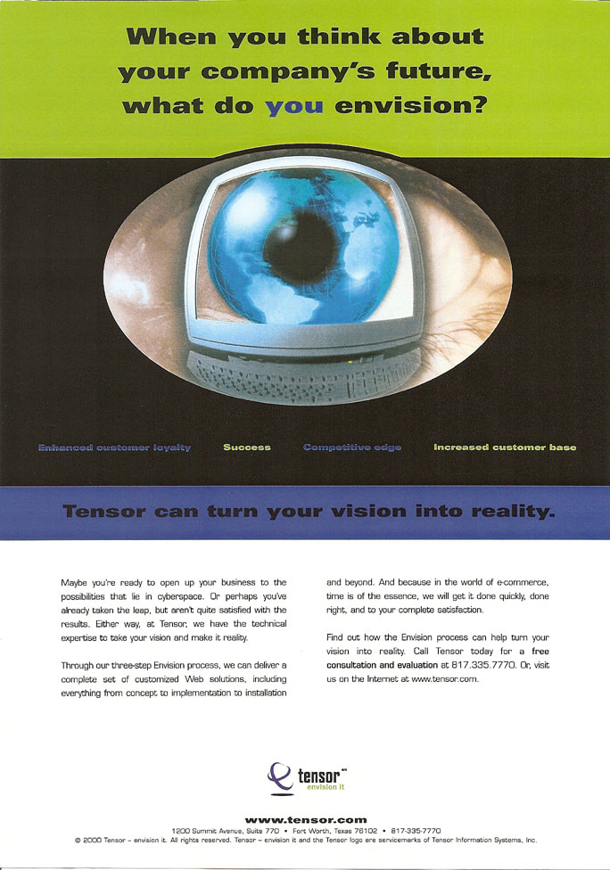
What I didn't know until I saw the published ad was that the designer had changed the order of the payoff copy so that it no longer made sense, and also made the type so small that it ceased to function as a payoff. The image to the right shows the ad as it ran. Here is the problem: The ad poses a question in the headline, and then answers it with 1) a large eye, and 2) a subhead that actually belongs with the body copy. The whole thing falls flat. |
|
My redesign
|
My design uses the same copy (minus the subhead, which became unnecessary in the new layout). In this format, the copy unfolds in a way that makes the setup/payoff structure work:
|
 |
Customer Communications Consistency
ADT Security Services is a company that grew through acquisition of other security companies. Customer communications went out from different offices across the U.S. (in some cases, they were handled at the city level). Each office had its own letterhead, layout, fonts, tone, and vocabulary based on who they were before they were part of ADT. ADT had official company letterhead, a company font set, and disclaimer requirements, but none of it was known about across the entire company or enforced.
I wanted to get all of these disparate communications looking and sounding like they came from the same company. First, though, I had to get buy-in from the division heads. To do this, I pulled five customer letters covering different topics, then reworked the copy to make them compliant with the company style guide and reflect the same tone. Finally, I put them on the actual company letterhead. Without even reading the content--simply looking at the letters posted on the wall from across a conference room--the sheer fact that everything looked sharp and consistent sold the idea.
When I completed the entire library, we had more than 960 customer letter and email templates.
This set of 10 thumbnails is intended to give you an idea of how inconsistent the letters were to begin with, even from a purely visual standpoint, and how much more uniform they appeared following my edit. Beneath the thumbnails are larger files that allow you to read each of the 10 letters both before and after my edits.
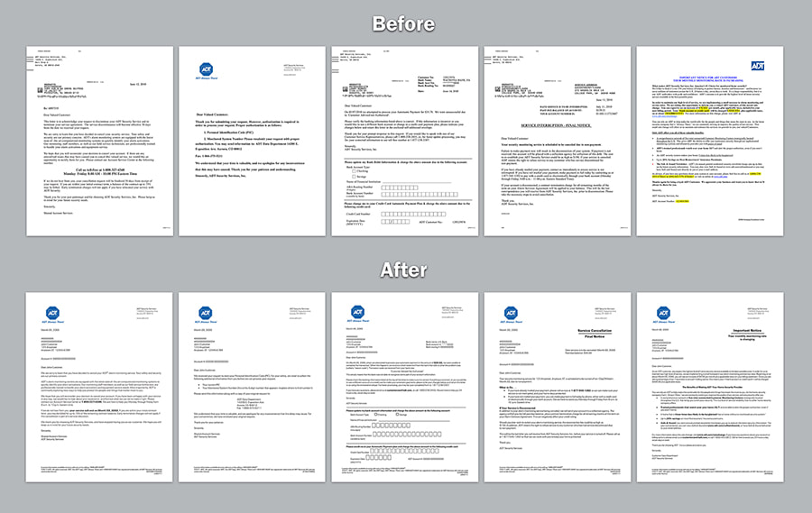
The top row features the original letters, with the rewrite for each directly underneath. When you click a thumbnail, the letter appears in the large window. You can then click on the large file to further enlarge it.
Program dissolution letter rewrite
AA was discontinuing its senior discount program, the AActive American Traveler Club, and replacing it with new discounted fares. The letter at the far left is what they sent to us to work from. I created two different versions of the letter: Version A (in the center) is straightforward, while Version B (far right) is warmer and eases into the message.
If I see that there is more than one viable approach to a communication, I will either talk through the options with a client first, or execute all options to present to the client.
If I see that there is more than one viable approach to a communication, I will either talk through the options with a client first, or execute all options to present to the client.

|

|

|
HomeVestors brochure targeting seniors
Original version:

Original piece -- outside spread

Inside spread
My rewrite:
- The original version was all about HomeVestors--what the company does, who they are, what they believe. The rewrite focuses on the potential customer, starting with the cover headline. The cover also clearly states the primary benefit, and includes an image of people enjoying that benefit.
- The introductory paragraph empathizes with the prospect, establishing confidence by letting them know that HomeVestors understands what may be leading them to consider a quick sale.
- The original version was copy-heavy with tiny, sans-serif text and tight leading. When your audience is primarily seniors, you need to be sensitive about readability. My rewrite pared down the verbiage, simplified it, and imbued it with a warmer, friendlier tone. I used the brand's approved serif typeface in a larger point size, and cranked up the leading.
- I added customer testimonials to increase credibility.
Outside spread

Inside spread
